3 color coordination tips any beginner can master

Even though we learn our colors in primary school, the art of color coordination is still tricky.

But knowing how to combine the right colors can help you transform your home, wardrobe, and creative projects.

We spoke with two color experts: Jill Morton, a color psychologist and brand identity expert who lectures at the Hawaii School of Architecture, and stylist and decorator Maria Killam, the author of “How To Choose Paint Colours: It’s All In The Undertones.”

“Everything in our lives has a color and color sends a message,” Morton tells Tech Insider.”It has a meaning.”

Take the pharmaceutical industry. Everything from the marketing materials to the colors of the medicine are important in driving sales.

“Think about pills,” Morton says. “If you’re going to take a pill to calm down and it’s a fiery bright red pill, that presentation likely isn’t going to make you feel calm.”

Part of that has to do with the color wheel. You’ve probably seen one of these before. The first circular color diagram was actually designed by Sir Isaac Newton in 1666 after he discovered sunlight contains all the colors of the rainbow with his experiments on prisms.

He concluded that red, yellow, and blue were the primary colors from which all other colors were derived, and created a “color circle” to prove it. Though he wasn’t entirely correct, it did lead many artists and scientists — from French chemist Michel Eugène Chevreul to painter Albert Henry Munsell — to generate their own wheels and research on color theory.

Our modern color wheel can be broken up into “cool” and “warm” colors. Cool colors are typically greens, blues, and purples while warm colors are reds, oranges, and yellows. The cool colors are associated with professionalism and feeling calm while warm colors are all about energy, passion, and exuberance.

The color wheel further breaks down into three categories. There are the primary colors: yellow, red, and blue.

Next, you have secondary colors, a combination of two primary colors: orange (yellow and red), purple (blue and red), and green (blue and yellow).

The third category consists of the tertiary colors, which are a combination of a primary color and a secondary color. That’s where you’ll find yellow-green or a reddish-violet.

These are the basic hues or parent colors. You can also add white, gray, or black to these colors — known as a tint, tone, or shade, respectively.

“Darkcolors like navy blue, deep forest greens, are more professional or more sedate, not calming necessarily. They’re serious colors,” Morton says. “Then there are more pure colors — bright green, bright red, bright blue — that have more energy and more power. Next are your lighter colors or ‘tints’ like pale pink and pale blue. They’re softer and gentler versions of whatever color their parent is.”

How do you pair colors together?

Color harmony is all about how best to pair primary, secondary, and tertiary colors.

“The thing about harmony is certain color combinations are just more pleasing to the eye,” Morton says. “If there are too many colors, it’s just chaos. It’s too unsettling, regardless of if you like the color or not. Amateurs use too many colors.”

She says there are three basic ways to pair colors that any beginner can master: Black and white plus any color; three neighboring colors on the color wheel, also known as harmonious colors; and two opposing colors on the color wheel, or complementary colors.

You can also get more complicated with color combinations like triadic and split-complementary. Here’s a helpful graphic from a KISSmetrics infographic:

The goal, as Killam explains it, is to have your colors flow well together and be pleasing to the eye. That also means making sure the base of the colors are similarly muted or bright.

“That’s where people screw up the most,” she adds. “They mix neutrals with different undertones or dirty and clean colors together.”

Instead, you’ll usually want to keep dirty colors — colors with gray or muted undertones — separate from clean colors without undertones.

So how can we apply this to our everyday lives?

Once you understand the basics of color theory, it can help with everything from home design to what you wear to a job interview.

“The color you wear sends a message,” Morton says, explaining that for a professional interview, you’d want to wear darker, more serous colors, while you can be a little more punchy and bright in a creative field. “I read someone got hired at Google because of their sneaker color,” she adds.

But while color coordination might seem difficult, it’s really all about how you respond to the aesthetic.

“The color you love is the color you should surround yourself with,” Morton says. “Personal preference has everything to do with what color you choose.”


5 Rules To Match Clothing Well | Matching Made EASY

Help!

My clothes don’t match.

I’ve been getting messages like that…

And honestly:

Matching clothes = easy to learn (if you stick to the basics)

However…

Matching clothes + being stylish = hard to MASTER!

There are certain “rules” that aren’t so strict.

Sometimes, you can bend them to in a way that works better.

But that takes research and lots of practice (don’t expect to get it right the first time).

So in the meantime…


Read below to find out 5 rules that make matching simple – and then keep learning!

This article is brought to you by Anson Belt & Buckle.

They have AMAZING products and superb customer service – which is why I’ve worked with them for almost a decade.

The best part? Their belt system makes matching a breeze. 

With their interchangeable belt system:


    • You get multiple belts and buckles (to match with your leathers & metals).
    • You always get an EXACT fit (unlike belts with traditional holes).
    • You can “customize” your belt to suit your outfit.
    • You’ll enjoy variety, flexibility, affordable prices & packages.

 Rule #1: Go For Complementary Over Matching

The first rule in matching is you don’t have to match things exactly! Specifically for your trousers and the multiple layers on top.

The ranking goes as follows:
Complementary > Matching > Bad match > Putting no thought

The reason we have complementary ahead of matching is between both techniques – the first one lets the clothes “build each other up” to create a higher-level look.

So if you’re going the “complementary” route – pay attention to the color wheel. The trick is to ensure the main colors of your wardrobe are as far apart on the color wheel as possible.

But that doesn’t mean you ought to avoid “matching” altogether. It’s actually safer than “complementary” (as there are cases when people get distracted by a combination of 2+ strong colors you’re wearing).

When you’re worried about crossing the line and showing a stark contrast, the fallback is to match your items based on a single color (like an oxblood belt with oxblood shoes).

In the end, matching = a pretty decent appearance. But it’s not likely going to amaze everybody around you the way a successful “complementary” outfit could.

00:19

10:

Note: To really maximize the power of “complementary” clothing – check out this article on color and contrast which teaches you how to pick clothes based on your skin tone, hair, and eye color.

A “bad match” might occur if the colors are closer to each other on the color wheel, or if there’s more than one bright color used. But it still beats making random choices and putting no thought! The effort still counts for something.

Rule #2: Leathers Should Match

Simply put, leather is AWESOME.

History shows how it represents wealth and status. So take advantage of that and let your leather pieces stand out as a group – with the same color.

But this rule isn’t strict. Two things you should focus on matching are (1) your shoes and (2) your belt.

Then follow-up by means of the color of your (3) watch strap and (4) leather bag – but only if it’s convenient. Don’t spend money just for that purpose.

And it’s important to remember in this case – the more different the colors of your leathers are, the worse of a match you’ll end up with. So pairing sleek black boots with a light brown belt is out of the question (unless you cover up the belt). Chocolate brown boots are a better alternative here.

Your black leather footwear can go with a belt that’s any shade of gray (since gray is a non-color). But if your want each leather piece to stand out equally – I suggest finding ONE particular color you like and stick to it.

That’s probably what you’ll need to do if your belt options are limited. Most of us have about 2-3 individual belts at home. Buying more could feel like a waste…

Thankfully, Anson has a solution to this. Through their unique belt system – you’re given more than just a handful of belts. You’re offered lots of variety! Anson provides at least three separate buckles plus separate straps (canvas straps have 13 various colors while cloth straps have three multicolored options).

And I know the family behind Anson. I’ve seen just how passionate they are about their stuff. Everything they produce has been worked to perfection. That’s why they’ve got consistently great reviews for their belts and customer service.


Anson Belt & Buckle makes it super easy to match any belt with the leather shoes you own. And their different buckles can be matched with other metals easily – which leads to our next rule.

Rule #3: Metals Should Match

It’s the same deal. You want your watch, belt buckle and other pieces of metal to match if possible.

Think about the item you like wearing most. If it’s a certain watch – take note of the color and consider getting a matching belt buckle.

Silver goes with silver, while gold goes with gold (or even brass if there’s no obvious difference). But this is a mere GUIDE. There are exceptions.

Maybe your wedding ring is gold but you look good with silver metals. Or maybe you have a silver watch that’s been passed on by your father.

So don’t even think about replacing items with sentimental value! Because contrasting metals are really minor problems.

Rule #4: Wear Items With The Same Level Of Formality

Would you pair up a black tie suit jacket with basketball shorts? You get the idea.

All clothing items fall somewhere along the formality scale. And since your outfit is primarily based on its “weakest link” – don’t match your most formal stuff with your least. It will only spoil how good you look as a whole.

A formal-casual combo is like oil and water. The two elements don’t mix. You’ll only end up raising a question mark in people’s heads. They’ll wonder if you had trouble finding something to wear, got dressed in a hurry, or were simply trying out a new (but strange) style.

However – it does get tricky regarding some types of leather shoes. A given pair may appear more casual than formal (especially if it has more broguing or details). You might be able to wear it with jeans but not with a business attire. So those things will require some trial and error.

And in general:


  • Darker colors = higher level of formality (especially for suit jackets and shoes)
  • Lighter colors = lower level of formality; best for casual events or summer wear

Rule #5: Learn From Famous People

You might be processing all this information and thinking “A doesn’t go with B but goes with C…” quite a lot. Juggling all these yes’s and no’s.

But the art of matching is much easier when you have a ROLE MODEL. Someone who’s always seen in public with a killer ensemble. It could be Idris Elba or Ryan Gosling on the red carpet, Bruno Mars when he performs on live television, or Roger Federer when he appears on watch ads.

Those are the masters you want to learn from. They present what works every time (or at least their stylists never fail to make the right calls, but that’s beside the point). Take inspiration from them – but don’t copy every little detail. Your individuality still needs to pop out.

Bonus: Explore Various Textures And Patterns

It helps if you know how to incorporate texture and pattern in menswear. So take the time to read up.

And here’s something you may not know:
You can actually get away with 4+ unique patterns at once! It’s a cool 
clothing combination worth trying. Just make sure the colors are muted, and no two patterns are of the same size or form. 

That’s one of many things you’ll figure out by experimenting. By trying this and that. It’s part of being a good matcher – and developing your own personal style.


So don’t be afraid to experiment now and then (even if it means breaking some of the rules above). But do have some trusted friends to preview your new outfit and say whether or not it looks fine.

5 Tips to Care for Cotton You Need To Know

cotton

With the right treatment and a bit of TLC, you can keep your cottons smelling great and unstained! And these 5 tips to care for cotton clothing should be in your laundry bible!

1. Discolouration

The best way to prevent your garments from losing their colour is to hand wash them in cold water.

If using the washing machine, always a good idea is to use colour catching sheets.

2. Stain treatment

Use a colour safe stain remover/stick to pre-treat your cotton garments in specific regions. Focus on the areas exposed to sweat and antiperspirant (the armpits and neckline areas) as well as on stain spots.


This will not only help you combat staining, but will also help eradicate body odours.

Spilled coffee or wine?

If the stain is fresh, run your item under the cold tap through the back of the stain for 3-5 minutes, and then rub the stain gently every minute or so. If the stain persists, repeat those actions 2 to 3 times.

To remove older stains, rub in a small amount of liquid laundry detergent while the surface is still moist, and then leave it to set for 5-7 minutes. After, gently rub the stain between your fingers again to help loosen it, and rinse thoroughly with cold water.

Alternative treatments suggest using vinegar, lemon juice, hydrogen peroxide or color safe bleach, baking soda, alcohol, and even egg yolk. More on this here

3. Drying, shrinkage and stretching

Note that cotton shrinks very fast on the first wash and in general is notoriously known for shrinkage.


Always read the care labels on your clothes before washing them for cleaning instructions. If unsure, stick to cold water.

Avoid drying your clothes on a wash line as hanging can inevitably stretch out their fabric.

If you are using the tumble dryer, do not leave your cotton items there until they are completely dry; instead, take them out while still a little damp and allow the moisture to evaporate gradually.

If your clothes did end up several sizes smaller or bigger, there are many life hacks on how to bring them back to life on the internet, including our own blog post about how to un-shrink your clothes.

4. Ironing and creasing

Cotton is a fairly tough fabric and can be ironed at higher temperatures without the risk of shininess or burning.


For a neater and smoother look, ensure you iron the back or inside of the fabric as well as the outside. Start ironing the underside, or inside the fabric first, so as to eliminate creases while ironing the outside.

If there are pre-existing stains/marks on your garments, you risk setting them into the fabric by ironing over them, however, to avoid this, we suggest not to iron the area, or to iron it using a damp cloth placed over it.

Cotton creases very easily and because of this it’s best if you store your cotton clothing by hanging it up rather than folding. For the better results of keeping their shape, invest in thick, shaped hangers rather than wire ones

There are multiple life hacks on how to rid of creasing online, but we like this page.

*On an environmentally friendly note, if opting for a hot shower method though, we’d recommend to take shower at the same time as removing the wrinkles on your clothing.

5. Don’t let you clothes be eaten

Yes, you heard it right – eaten! By moths and silverfish.


Like silk and wool, cotton is an organic fabric, and absorbs sweat and natural oils from the skin very easily, it often becomes the prey of these home pests.

In order to ensure that you favourite cotton garments are safe, don’t leave your dirty clothes lying around for too long – keeping on top of your laundry is one of the best methods of stopping moths becoming a problem. And remember that Laundrapp is always here for you!

Declutter your wardrobe – more space between clothing means there’s less of a chance that moths can eat through multiple garments at once. Vacuum every corner of your wardrobe. Many people never think to vacuum inside their cupboards, but this is where the moths and silverfish will be hiding.

If you’ve got some old wool lying around, hang that among your other clothing – moths will almost always go for wool above all others.


And don’t forget the last, if not a bit stinky, remedy – mothballs!

SPRING 2019 MENSWEAR A-Cold-Wall

Spring delivered a breakthrough collection for A-Cold-Wall’s Samuel Ross, in ways both personal (Ross was feeling good after being a finalist in this year’s LVMH prize) and physical: His runway show concluded with a Styrofoam structure being punched to fragments by a horde of clay-dyed and rag-wrapped zombie-chimeras (or something of that ilk). A bit of that wrecked detritus landed on Virgil Abloh (whom Ross once worked for) in the front row; all guests were provided with clear protective glasses, earbuds, and face masks to safeguard against the “experience.” And from that ruined crypt/incubator came a wet, naked man, crawling not in blood, but a “primary-red liquid used to represent rebirth,” said Ross. “This protagonist in red represents the clarity in mind and thinking that has emerged.”

If that sounds the opposite of clarified, it’s because it was. Ross is clearly very intelligent, and goes deep into mining the cerebral headspace between architecture, socio-spatial relationships, and fashion’s place in this matrix, but there’s a fine line between flexing one’s brainpower effectively and overintellectualization. Though his product output has been significantly upgraded, the ultimate impression left today was that Spring felt . . . honestly, too complicated. A cleaner message, and simpler clothes (there were too many deconstructed and padded-up details, plus odd PVC shirting), might be the key in propelling him to greater recognition and acclaim. That’s partially how Abloh, also frequently architecture-inspired, has attained his level of success; the concept is clearer and more palatable. Ross’s show notes read: “[The collection] marks a new direction and accelerated level of production for A-Cold-Wall,” signifying that he is looking to build the business. Highbrow is fine, but it’s better, in a salable sense, when imbued with high digestibility. That’s not to say that A-Cold-Wall’s Spring outing didn’t have strong highlights. There were bolts and beams of commercial clout and, in fact, a bit more refinement than we’ve seen from Ross in the past, like with a silvery blue-black trench coat; a convincing, asymmetrical two-tone puffa; and a slouchy top coat in heather gray with strips of navy and yellow. The best-in-show pieces may have ultimately been the hard-sided briefcases and/or laptop cases. These calibrated Ross’s touch points: construction, social rhythms, and the threads between the two, in the most absorbable and desirable ways possible.

Rachel Zoe

Lorem ipsum dolor sit amet, consectetur adipiscing elit. Integer nec odio. Praesent libero. Sed cursus ante dapibus diam. Sed nisi. Nulla quis sem at nibh elementum imperdiet. Duis sagittis ipsum. Praesent mauris. Fusce nec tellus sed augue semper porta. Mauris massa. Vestibulum lacinia arcu eget nulla. Class aptent taciti sociosqu ad litora torquent per conubia nostra, per inceptos himenaeos.

Curabitur sodales ligula in libero. Sed dignissim lacinia nunc. Curabitur tortor. Pellentesque nibh. Aenean quam. In scelerisque sem at dolor. Maecenas mattis. Sed convallis tristique sem. Proin ut ligula vel nunc egestas porttitor. Morbi lectus risus, iaculis vel, suscipit quis, luctus non, massa. Fusce ac turpis quis ligula lacinia aliquet. Mauris ipsum. Nulla metus metus, ullamcorper vel, tincidunt sed, euismod in, nibh.

Quisque volutpat condimentum velit. Class aptent taciti sociosqu ad litora torquent per conubia nostra, per inceptos himenaeos. Nam nec ante. Sed lacinia, urna non tincidunt mattis, tortor neque adipiscing diam, a cursus ipsum ante quis turpis. Nulla facilisi. Ut fringilla. Suspendisse potenti. Nunc feugiat mi a tellus consequat imperdiet. Vestibulum sapien. Proin quam. Etiam ultrices. Suspendisse in justo eu magna luctus suscipit. Sed lectus. Integer euismod lacus luctus magna.

Vestibulum lacinia arcu

Quisque cursus, metus vitae pharetra auctor, sem massa mattis sem, at interdum magna augue eget diam. Vestibulum ante ipsum primis in faucibus orci luctus et ultrices posuere cubilia Curae; Morbi lacinia molestie dui. Praesent blandit dolor. Sed non quam. In vel mi sit amet augue congue elementum. Morbi in ipsum sit amet pede facilisis laoreet. Donec lacus nunc, viverra nec, blandit vel, egestas et, augue. Vestibulum tincidunt malesuada tellus. Ut ultrices ultrices enim. Curabitur sit amet mauris. Morbi in dui quis est pulvinar ullamcorper. Nulla facilisi.

Integer lacinia sollicitudin massa. Cras metus. Sed aliquet risus a tortor. Integer id quam. Morbi mi. Quisque nisl felis, venenatis tristique, dignissim in, ultrices sit amet, augue. Proin sodales libero eget ante.

Aenean lectus elit, fermentum non, convallis id, sagittis at, neque. Nullam mauris orci, aliquet et, iaculis et, viverra vitae, ligula. Nulla ut felis in purus aliquam imperdiet. Maecenas aliquet mollis lectus. Vivamus consectetuer risus et tortor. Lorem ipsum dolor sit amet, consectetur adipiscing elit. Integer nec odio. Praesent libero. Sed cursus ante dapibus diam. Sed nisi. Nulla quis sem at nibh elementum imperdiet. Duis sagittis ipsum.

The Color Wheel | Color Coordination for Men

Understanding color to better assist a man’s outfit.

The most expensive clothes in the world will not look good if they’re not matching.

Proper color coordination can help your outfit glow if it’s boring, or tone it down a bit if it’s too loud. Below are the basics about color coordination, as well as tips for putting them together to help your ensemble.

Below are the basics about color coordination, as well as tips for putting them together to help your ensemble.

Introduction – The Color Wheel and Color Basics

Color coordination should never be overlooked by the man building a wardrobe. Wearing the right colors is just as important in an outfit as proper fit as colors have to ability to make or break an outfit. They can make a man look bland and boring or they can make a man look loud and foolish.


With this in mind, finding a happy medium is essential to developing the look men strive for. By looking at the basics of color and how to incorporate these basics into an outfit we will be able to confidently develop the knowledge necessary to match our clothes properly, allowing us to look our best whether in a custom suit or jeans and shirt.

color

Color Basics – The Color Wheel


The color wheel – which was developed by Sir Isaac Newton in 1666 – is the basis for all color theory. The 12 colors are called “hues.”

Adding a little bit of white to any of these colors will make them a tint lighter, while adding a little bit of black will make them a tint darker. In theory, all of these colors are connected, so coordinating them works, but knowing how to do that properly is essential.

The closer the colors are to each other, the easier they are to coordinate. For example, wearing a blue dress shirt with a tie that has blue-green strips is a good, simple coordination. On the other hand, trying to mix yellow-green and red-violet can get messy, so knowing how to mix these colors is important.

There are 3 Primary Colors:

  • Red
  • Yellow
  • Blue

These are the only colors that can’t be made by adding or mixing other colors together, but you can mix two or more of the primary colors together and make any other color. Mixing colors can create two effects: harmony or disorganization. When we mix colors in an outfit, we want to use colors that compliment each other and create an appearance that’s pleasant to look at, not a mash of color that looks chaotic.

Understanding Men’s Contrast

The first things to look at when learning about contrast if understanding the colors and contrasts of your body. Your hair color, eye color, and skin color play an important role in developing the proper contrast within your outfit.

These three factors, which every man has, determine whether a man is of high, low, or medium contrast.


A Color Combination For A High Contrast Man

color 3

High Contrast Men

Men whose hair color contrasts their skin color greatly fall under this category.

For example, men with black hair and white skin. The most important thing for men in this category is to try to mimic this same contrast with their clothes.

A dark suit (navy blue or black) and a white dress shirt or a charcoal gray suit with a blue dress shirt will both provide this desired contrast. As for ties, any tie that distinctly stands out from the shirt will compliment a high contrast man.

Low Contrast Men

Low contrast men have a much more subtle, if any, contrast. Men with light hair and light skin fall into this category, and (usually) so do men with red hair, bald men, and men with little hair.

The ability for a low contrast man to look good is the the complete opposite from that of a high contrast man.

A color combination for low contrast men

A significant contrast in a low contast man’s outfit will conflict with his low contrast complexion. Low contrast men should strive for a monochromatic (single color) look.

A dark blue or earth-toned dress shirt with a dark suit will work best most of the time. As for ties, something that contrasts too much will take attention away from the face, so having a tie similar to the color of your suit and shirt will work best.


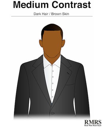
Medium Contrast Men

color

Men who don’t fall under either extreme usually fall into this category. Dark skinned men with dark hair or light skinned men with white or gray hair usually fit into this group.

Since there is such a wide variety of facial tones and hair colors, it is difficult to pinpoint specific guidance to this group. Usually, men in this group will tend to be somewhat close either extreme.

The mentioned dark skinned man with dark hair would lean more towards the high contrast side, while the light skinned man with white or gray hair leans more towards the low contrast side.

With that being said, it should be mentioned that medium contrast men could easily explore and enjoy what both sides have to offer, but should do so without wandering too far off into one of the extremes.

There are many components that go into proper coordination, such as understanding the role of seasons and what your environment is like.

Taking a look at these aspects and incorporating them into your wardrobe will only help you look better.

Mixing Colors in a Man’s Outfit

Mixing colors is a very important of a man’s attire, but doing it correctly is more important. If we don’t mix colors or use any variety, the end result is most likely going to be bland or boring, which people don’t want to look at.

If we mix too many colors, or mix colors in a non-harmonious way, it leads to a chaotic and disorganized appearance. This is why it is essential to know how to properly coordinate the colors of an outfit.

00:06

09:30


Let us cover 5 key color wheel concepts

1. Core Color – the dominant color in a color scheme. For example in terms of an ensemble, it would usually be the color of a jacket or sweater.

2. Accent Colors – Secondary colors used in a color scheme. Accent colors may be complementary, triad, analogous or neutral.


3. Complementary colors – colors that are directly across from one another on the color wheel.

color

4. Triad Colors – Three colors that are equidistant on the color wheel.

color

5. Analogous Colors – Colors that border each other on the color wheel.

color

Analogous Colors
Photos courtesy of R. Andrew Gilchrist
http://www.askandyaboutclothes.com

When we stick to these specific combination’s when we’re coordinating colors, it’s hard to go wrong. Of course, not every outfit has to be 100% with the color wheel, but getting to far outside of the wheel’s guidelines can get us into trouble, so using this as a reference is key when coordinating colors.

Conclusion – Just touching the surface of the Color Wheel

Some might say that coordinating colors in an outfit is a science. To an extent, it might be, but the most important thing about clothing is how you feel. Not everything you wear has to be compatible with the Color Wheel.


The Wheel will provide guidelines and suggestions as to how to properly match clothing, but when it comes down to it, it’s about how you think you look in your clothes, and how they make you feel.

Cras metus sed aliquet risus a tortor

Lorem ipsum dolor sit amet, consectetur adipiscing elit. Integer nec odio. Praesent libero. Sed cursus ante dapibus diam. Sed nisi. Nulla quis sem at nibh elementum imperdiet. Duis sagittis ipsum. Praesent mauris. Fusce nec tellus sed augue semper porta. Mauris massa. Vestibulum lacinia arcu eget nulla. Class aptent taciti sociosqu ad litora torquent per conubia nostra, per inceptos himenaeos.

Curabitur sodales ligula in libero. Sed dignissim lacinia nunc. Curabitur tortor. Pellentesque nibh. Aenean quam. In scelerisque sem at dolor. Maecenas mattis. Sed convallis tristique sem. Proin ut ligula vel nunc egestas porttitor. Morbi lectus risus, iaculis vel, suscipit quis, luctus non, massa. Fusce ac turpis quis ligula lacinia aliquet. Mauris ipsum. Nulla metus metus, ullamcorper vel, tincidunt sed, euismod in, nibh.

Quisque volutpat condimentum velit. Class aptent taciti sociosqu ad litora torquent per conubia nostra, per inceptos himenaeos. Nam nec ante. Sed lacinia, urna non tincidunt mattis, tortor neque adipiscing diam, a cursus ipsum ante quis turpis. Nulla facilisi. Ut fringilla. Suspendisse potenti. Nunc feugiat mi a tellus consequat imperdiet. Vestibulum sapien. Proin quam. Etiam ultrices. Suspendisse in justo eu magna luctus suscipit. Sed lectus. Integer euismod lacus luctus magna.

Vestibulum lacinia arcu

Quisque cursus, metus vitae pharetra auctor, sem massa mattis sem, at interdum magna augue eget diam. Vestibulum ante ipsum primis in faucibus orci luctus et ultrices posuere cubilia Curae; Morbi lacinia molestie dui. Praesent blandit dolor. Sed non quam. In vel mi sit amet augue congue elementum. Morbi in ipsum sit amet pede facilisis laoreet. Donec lacus nunc, viverra nec, blandit vel, egestas et, augue. Vestibulum tincidunt malesuada tellus. Ut ultrices ultrices enim. Curabitur sit amet mauris. Morbi in dui quis est pulvinar ullamcorper. Nulla facilisi.

Integer lacinia sollicitudin massa. Cras metus. Sed aliquet risus a tortor. Integer id quam. Morbi mi. Quisque nisl felis, venenatis tristique, dignissim in, ultrices sit amet, augue. Proin sodales libero eget ante.

Aenean lectus elit, fermentum non, convallis id, sagittis at, neque. Nullam mauris orci, aliquet et, iaculis et, viverra vitae, ligula. Nulla ut felis in purus aliquam imperdiet. Maecenas aliquet mollis lectus. Vivamus consectetuer risus et tortor. Lorem ipsum dolor sit amet, consectetur adipiscing elit. Integer nec odio. Praesent libero. Sed cursus ante dapibus diam. Sed nisi. Nulla quis sem at nibh elementum imperdiet. Duis sagittis ipsum.

Quis ligula lacinia aliquet mauris ipsum

Lorem ipsum dolor sit amet, consectetur adipiscing elit. Integer nec odio. Praesent libero. Sed cursus ante dapibus diam. Sed nisi. Nulla quis sem at nibh elementum imperdiet. Duis sagittis ipsum. Praesent mauris. Fusce nec tellus sed augue semper porta. Mauris massa. Vestibulum lacinia arcu eget nulla. Class aptent taciti sociosqu ad litora torquent per conubia nostra, per inceptos himenaeos.

Curabitur sodales ligula in libero. Sed dignissim lacinia nunc. Curabitur tortor. Pellentesque nibh. Aenean quam. In scelerisque sem at dolor. Maecenas mattis. Sed convallis tristique sem. Proin ut ligula vel nunc egestas porttitor. Morbi lectus risus, iaculis vel, suscipit quis, luctus non, massa. Fusce ac turpis quis ligula lacinia aliquet. Mauris ipsum. Nulla metus metus, ullamcorper vel, tincidunt sed, euismod in, nibh.

Quisque volutpat condimentum velit. Class aptent taciti sociosqu ad litora torquent per conubia nostra, per inceptos himenaeos. Nam nec ante. Sed lacinia, urna non tincidunt mattis, tortor neque adipiscing diam, a cursus ipsum ante quis turpis. Nulla facilisi. Ut fringilla. Suspendisse potenti. Nunc feugiat mi a tellus consequat imperdiet. Vestibulum sapien. Proin quam. Etiam ultrices. Suspendisse in justo eu magna luctus suscipit. Sed lectus. Integer euismod lacus luctus magna.

Vestibulum lacinia arcu

Quisque cursus, metus vitae pharetra auctor, sem massa mattis sem, at interdum magna augue eget diam. Vestibulum ante ipsum primis in faucibus orci luctus et ultrices posuere cubilia Curae; Morbi lacinia molestie dui. Praesent blandit dolor. Sed non quam. In vel mi sit amet augue congue elementum. Morbi in ipsum sit amet pede facilisis laoreet. Donec lacus nunc, viverra nec, blandit vel, egestas et, augue. Vestibulum tincidunt malesuada tellus. Ut ultrices ultrices enim. Curabitur sit amet mauris. Morbi in dui quis est pulvinar ullamcorper. Nulla facilisi.

Integer lacinia sollicitudin massa. Cras metus. Sed aliquet risus a tortor. Integer id quam. Morbi mi. Quisque nisl felis, venenatis tristique, dignissim in, ultrices sit amet, augue. Proin sodales libero eget ante.

Aenean lectus elit, fermentum non, convallis id, sagittis at, neque. Nullam mauris orci, aliquet et, iaculis et, viverra vitae, ligula. Nulla ut felis in purus aliquam imperdiet. Maecenas aliquet mollis lectus. Vivamus consectetuer risus et tortor. Lorem ipsum dolor sit amet, consectetur adipiscing elit. Integer nec odio. Praesent libero. Sed cursus ante dapibus diam. Sed nisi. Nulla quis sem at nibh elementum imperdiet. Duis sagittis ipsum.

Nulla metus metus ullamcorper vel tincidunt

Lorem ipsum dolor sit amet, consectetur adipiscing elit. Integer nec odio. Praesent libero. Sed cursus ante dapibus diam. Sed nisi. Nulla quis sem at nibh elementum imperdiet. Duis sagittis ipsum. Praesent mauris. Fusce nec tellus sed augue semper porta. Mauris massa. Vestibulum lacinia arcu eget nulla. Class aptent taciti sociosqu ad litora torquent per conubia nostra, per inceptos himenaeos.

Curabitur sodales ligula in libero. Sed dignissim lacinia nunc. Curabitur tortor. Pellentesque nibh. Aenean quam. In scelerisque sem at dolor. Maecenas mattis. Sed convallis tristique sem. Proin ut ligula vel nunc egestas porttitor. Morbi lectus risus, iaculis vel, suscipit quis, luctus non, massa. Fusce ac turpis quis ligula lacinia aliquet. Mauris ipsum. Nulla metus metus, ullamcorper vel, tincidunt sed, euismod in, nibh.

Quisque volutpat condimentum velit. Class aptent taciti sociosqu ad litora torquent per conubia nostra, per inceptos himenaeos. Nam nec ante. Sed lacinia, urna non tincidunt mattis, tortor neque adipiscing diam, a cursus ipsum ante quis turpis. Nulla facilisi. Ut fringilla. Suspendisse potenti. Nunc feugiat mi a tellus consequat imperdiet. Vestibulum sapien. Proin quam. Etiam ultrices. Suspendisse in justo eu magna luctus suscipit. Sed lectus. Integer euismod lacus luctus magna.

Vestibulum lacinia arcu

Quisque cursus, metus vitae pharetra auctor, sem massa mattis sem, at interdum magna augue eget diam. Vestibulum ante ipsum primis in faucibus orci luctus et ultrices posuere cubilia Curae; Morbi lacinia molestie dui. Praesent blandit dolor. Sed non quam. In vel mi sit amet augue congue elementum. Morbi in ipsum sit amet pede facilisis laoreet. Donec lacus nunc, viverra nec, blandit vel, egestas et, augue. Vestibulum tincidunt malesuada tellus. Ut ultrices ultrices enim. Curabitur sit amet mauris. Morbi in dui quis est pulvinar ullamcorper. Nulla facilisi.

Integer lacinia sollicitudin massa. Cras metus. Sed aliquet risus a tortor. Integer id quam. Morbi mi. Quisque nisl felis, venenatis tristique, dignissim in, ultrices sit amet, augue. Proin sodales libero eget ante.

Aenean lectus elit, fermentum non, convallis id, sagittis at, neque. Nullam mauris orci, aliquet et, iaculis et, viverra vitae, ligula. Nulla ut felis in purus aliquam imperdiet. Maecenas aliquet mollis lectus. Vivamus consectetuer risus et tortor. Lorem ipsum dolor sit amet, consectetur adipiscing elit. Integer nec odio. Praesent libero. Sed cursus ante dapibus diam. Sed nisi. Nulla quis sem at nibh elementum imperdiet. Duis sagittis ipsum.

Luctus non massa fusce ac turpis quis

Lorem ipsum dolor sit amet, consectetur adipiscing elit. Integer nec odio. Praesent libero. Sed cursus ante dapibus diam. Sed nisi. Nulla quis sem at nibh elementum imperdiet. Duis sagittis ipsum. Praesent mauris. Fusce nec tellus sed augue semper porta. Mauris massa. Vestibulum lacinia arcu eget nulla. Class aptent taciti sociosqu ad litora torquent per conubia nostra, per inceptos himenaeos.

Curabitur sodales ligula in libero. Sed dignissim lacinia nunc. Curabitur tortor. Pellentesque nibh. Aenean quam. In scelerisque sem at dolor. Maecenas mattis. Sed convallis tristique sem. Proin ut ligula vel nunc egestas porttitor. Morbi lectus risus, iaculis vel, suscipit quis, luctus non, massa. Fusce ac turpis quis ligula lacinia aliquet. Mauris ipsum. Nulla metus metus, ullamcorper vel, tincidunt sed, euismod in, nibh.

Quisque volutpat condimentum velit. Class aptent taciti sociosqu ad litora torquent per conubia nostra, per inceptos himenaeos. Nam nec ante. Sed lacinia, urna non tincidunt mattis, tortor neque adipiscing diam, a cursus ipsum ante quis turpis. Nulla facilisi. Ut fringilla. Suspendisse potenti. Nunc feugiat mi a tellus consequat imperdiet. Vestibulum sapien. Proin quam. Etiam ultrices. Suspendisse in justo eu magna luctus suscipit. Sed lectus. Integer euismod lacus luctus magna.

Vestibulum lacinia arcu

Quisque cursus, metus vitae pharetra auctor, sem massa mattis sem, at interdum magna augue eget diam. Vestibulum ante ipsum primis in faucibus orci luctus et ultrices posuere cubilia Curae; Morbi lacinia molestie dui. Praesent blandit dolor. Sed non quam. In vel mi sit amet augue congue elementum. Morbi in ipsum sit amet pede facilisis laoreet. Donec lacus nunc, viverra nec, blandit vel, egestas et, augue. Vestibulum tincidunt malesuada tellus. Ut ultrices ultrices enim. Curabitur sit amet mauris. Morbi in dui quis est pulvinar ullamcorper. Nulla facilisi.

Integer lacinia sollicitudin massa. Cras metus. Sed aliquet risus a tortor. Integer id quam. Morbi mi. Quisque nisl felis, venenatis tristique, dignissim in, ultrices sit amet, augue. Proin sodales libero eget ante.

Aenean lectus elit, fermentum non, convallis id, sagittis at, neque. Nullam mauris orci, aliquet et, iaculis et, viverra vitae, ligula. Nulla ut felis in purus aliquam imperdiet. Maecenas aliquet mollis lectus. Vivamus consectetuer risus et tortor. Lorem ipsum dolor sit amet, consectetur adipiscing elit. Integer nec odio. Praesent libero. Sed cursus ante dapibus diam. Sed nisi. Nulla quis sem at nibh elementum imperdiet. Duis sagittis ipsum.

Pellentesque nibh aenean quam in scelerisque

Lorem ipsum dolor sit amet, consectetur adipiscing elit. Integer nec odio. Praesent libero. Sed cursus ante dapibus diam. Sed nisi. Nulla quis sem at nibh elementum imperdiet. Duis sagittis ipsum. Praesent mauris. Fusce nec tellus sed augue semper porta. Mauris massa. Vestibulum lacinia arcu eget nulla. Class aptent taciti sociosqu ad litora torquent per conubia nostra, per inceptos himenaeos.

Curabitur sodales ligula in libero. Sed dignissim lacinia nunc. Curabitur tortor. Pellentesque nibh. Aenean quam. In scelerisque sem at dolor. Maecenas mattis. Sed convallis tristique sem. Proin ut ligula vel nunc egestas porttitor. Morbi lectus risus, iaculis vel, suscipit quis, luctus non, massa. Fusce ac turpis quis ligula lacinia aliquet. Mauris ipsum. Nulla metus metus, ullamcorper vel, tincidunt sed, euismod in, nibh.

Quisque volutpat condimentum velit. Class aptent taciti sociosqu ad litora torquent per conubia nostra, per inceptos himenaeos. Nam nec ante. Sed lacinia, urna non tincidunt mattis, tortor neque adipiscing diam, a cursus ipsum ante quis turpis. Nulla facilisi. Ut fringilla. Suspendisse potenti. Nunc feugiat mi a tellus consequat imperdiet. Vestibulum sapien. Proin quam. Etiam ultrices. Suspendisse in justo eu magna luctus suscipit. Sed lectus. Integer euismod lacus luctus magna.

Vestibulum lacinia arcu

Quisque cursus, metus vitae pharetra auctor, sem massa mattis sem, at interdum magna augue eget diam. Vestibulum ante ipsum primis in faucibus orci luctus et ultrices posuere cubilia Curae; Morbi lacinia molestie dui. Praesent blandit dolor. Sed non quam. In vel mi sit amet augue congue elementum. Morbi in ipsum sit amet pede facilisis laoreet. Donec lacus nunc, viverra nec, blandit vel, egestas et, augue. Vestibulum tincidunt malesuada tellus. Ut ultrices ultrices enim. Curabitur sit amet mauris. Morbi in dui quis est pulvinar ullamcorper. Nulla facilisi.

Integer lacinia sollicitudin massa. Cras metus. Sed aliquet risus a tortor. Integer id quam. Morbi mi. Quisque nisl felis, venenatis tristique, dignissim in, ultrices sit amet, augue. Proin sodales libero eget ante.

Aenean lectus elit, fermentum non, convallis id, sagittis at, neque. Nullam mauris orci, aliquet et, iaculis et, viverra vitae, ligula. Nulla ut felis in purus aliquam imperdiet. Maecenas aliquet mollis lectus. Vivamus consectetuer risus et tortor. Lorem ipsum dolor sit amet, consectetur adipiscing elit. Integer nec odio. Praesent libero. Sed cursus ante dapibus diam. Sed nisi. Nulla quis sem at nibh elementum imperdiet. Duis sagittis ipsum.

Lacinia nunc curabitur tortor pellentesque nibh

Lorem ipsum dolor sit amet, consectetur adipiscing elit. Integer nec odio. Praesent libero. Sed cursus ante dapibus diam. Sed nisi. Nulla quis sem at nibh elementum imperdiet. Duis sagittis ipsum. Praesent mauris. Fusce nec tellus sed augue semper porta. Mauris massa. Vestibulum lacinia arcu eget nulla. Class aptent taciti sociosqu ad litora torquent per conubia nostra, per inceptos himenaeos.

Curabitur sodales ligula in libero. Sed dignissim lacinia nunc. Curabitur tortor. Pellentesque nibh. Aenean quam. In scelerisque sem at dolor. Maecenas mattis. Sed convallis tristique sem. Proin ut ligula vel nunc egestas porttitor. Morbi lectus risus, iaculis vel, suscipit quis, luctus non, massa. Fusce ac turpis quis ligula lacinia aliquet. Mauris ipsum. Nulla metus metus, ullamcorper vel, tincidunt sed, euismod in, nibh.

Quisque volutpat condimentum velit. Class aptent taciti sociosqu ad litora torquent per conubia nostra, per inceptos himenaeos. Nam nec ante. Sed lacinia, urna non tincidunt mattis, tortor neque adipiscing diam, a cursus ipsum ante quis turpis. Nulla facilisi. Ut fringilla. Suspendisse potenti. Nunc feugiat mi a tellus consequat imperdiet. Vestibulum sapien. Proin quam. Etiam ultrices. Suspendisse in justo eu magna luctus suscipit. Sed lectus. Integer euismod lacus luctus magna.

Vestibulum lacinia arcu

Quisque cursus, metus vitae pharetra auctor, sem massa mattis sem, at interdum magna augue eget diam. Vestibulum ante ipsum primis in faucibus orci luctus et ultrices posuere cubilia Curae; Morbi lacinia molestie dui. Praesent blandit dolor. Sed non quam. In vel mi sit amet augue congue elementum. Morbi in ipsum sit amet pede facilisis laoreet. Donec lacus nunc, viverra nec, blandit vel, egestas et, augue. Vestibulum tincidunt malesuada tellus. Ut ultrices ultrices enim. Curabitur sit amet mauris. Morbi in dui quis est pulvinar ullamcorper. Nulla facilisi.

Integer lacinia sollicitudin massa. Cras metus. Sed aliquet risus a tortor. Integer id quam. Morbi mi. Quisque nisl felis, venenatis tristique, dignissim in, ultrices sit amet, augue. Proin sodales libero eget ante.

Aenean lectus elit, fermentum non, convallis id, sagittis at, neque. Nullam mauris orci, aliquet et, iaculis et, viverra vitae, ligula. Nulla ut felis in purus aliquam imperdiet. Maecenas aliquet mollis lectus. Vivamus consectetuer risus et tortor. Lorem ipsum dolor sit amet, consectetur adipiscing elit. Integer nec odio. Praesent libero. Sed cursus ante dapibus diam. Sed nisi. Nulla quis sem at nibh elementum imperdiet. Duis sagittis ipsum.